Roku Overhauls Its Home Screen for the First Time in a Decade: More Personalization, Bigger Ads, and a Dash of AI

After ten long years of a largely static user interface, Roku is finally giving its iconic home screen a dramatic facelift. The streaming giant—whose platform powers millions of living rooms—unveiled a redesigned interface that leans heavily into AI-driven personalization while simultaneously expanding its ad real estate. The result is a bold, calculated gamble that could either win back defectors or alienate its loyal user base.
Revealed at a private event in New York City, the new look marks the most significant overhaul of Roku's core screen since the company first hit the market. For an industry that thrives on constant iteration, a decade is an eternity—and Roku's competitors have long since left the company's static layout in the dust.
The Big Change—and a Bigger Ad
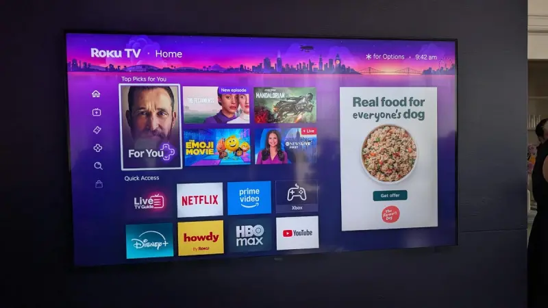
The most immediately noticeable alteration is the location and prominence of the advertising marquee. Previously tucked away behind app icons, the ad space now occupies a permanent spot on the right-hand side of the screen. Preston Smalley, Roku's Vice President of Product, described the home screen as "one of the most valuable pieces of real estate in streaming," noting that half of all broadband users interact with it regularly.
That prime pixel estate will now feature a mix of paid placements and algorithmically suggested shows. Smalley told reporters that the ratio of paid to curated content is fluid and will be adjusted over time. One thing is clear: the ad unit is not dismissible. Users can't swipe it away or hide it—it's a fixed element of the new experience.
For Roku, which generated roughly $3.5 billion in platform revenue last year (including ads and subscriptions), this move is a logical, if aggressive, step. Streaming device makers have long walked a tightrope between user experience and monetization. Roku's decision to double down on ad permanence signals that it believes viewers will tolerate more commercial intrusion in exchange for other improvements.
Personalization Meets AI: The 'For You' Section
At the top of the new home screen sits a section called "For You," a curated row that blends machine learning with user behavior. Roku says the feature aggregates content from multiple sources—including what you've saved, what you're currently watching, and predictive suggestions powered by AI. It's an attempt to solve a long-standing pain point: chaos across dozens of streaming apps.
Google TV and Amazon Fire TV have leaned hard into content-first interfaces for years, offering unified watchlists and cross-app recommendations. Roku, by contrast, has historically presented a menu of app icons and left discovery to the individual services. The "For You" section is a direct response to that competitive pressure.
But unlike its rivals, Roku is giving users a choice. The "For You" row, along with a new "Quick Access" bar at the bottom (which surfaces your most-used apps), can be toggled off. Doing so returns the screen to the more traditional app grid that long-time users know. This configurable approach is a smart middle ground—one that acknowledges the emotional attachment many feel to the old interface while still modernizing for those who crave discovery.
Customization as a Peace Offering
The left-hand menu has also been reorganized, offering direct links to Subscriptions, Search, and Settings. The overall layout—a vertical menu on the left, content in the center, and ads on the right—mirrors the design language seen in smart TVs from brands like Samsung and LG. Yet Roku's version stands out because of its modularity.
"We know change can be hard," Smalley said during the event. "That's why we've built in options to let users tailor the experience to their preference." Indeed, the ability to revert to a near-classic layout may soften the blow for a segment of viewers who have used Roku for years and resist any modification. In an era where streaming interfaces are increasingly locked down, that flexibility is a genuine differentiator.
From a design standpoint, the update addresses a long-standing criticism: the old screen felt dated. In side-by-side comparisons, the new interface appears cleaner, with better use of whitespace and more dynamic artwork. For reviewers like Ty Pendlebury, who has covered home entertainment for nearly two decades, the revamp is overdue. "The interface had started to feel a bit dusty," he noted after the event. "More customizability might bring back people who've moved to content-first competitors."
Industry Implications: A Battle for the Living Room
Roku remains the most popular streaming platform in North America by active accounts, but its dominance is under threat. Google TV's integration with Android and YouTube, plus Amazon Fire TV's aggressive Alexa ecosystem, have eroded Roku's lead in recent years. The new home screen is a strategic attempt to close the feature gap without sacrificing the simplicity that made Roku a household name.
Yet the permanent ad placement raises eyebrows. Streaming viewers are increasingly ad-averse; services like Netflix and Disney+ have faced backlash for introducing lower-priced ad tiers. Placing a non-dismissible ad directly on the home screen could spark a similar outcry. Roku is betting that the trade-off—more relevant suggestions and a smarter interface—will win the day.
Advertisers, of course, are thrilled. The new marquee offers guaranteed visibility, and the AI recommendations mean placements can be more precisely targeted. Smalley hinted that future iterations might include interactive ad units or shoppable content, though he offered no timeline.
Rollout and Early Access
Roku says the new home screen will roll out to all devices over the coming weeks and months. For the impatient, there's an unusual shortcut: Smalley told CNET that users can call customer service to request early access. This backdoor approach is uncharacteristic for Roku, which typically staggers updates carefully, and suggests the company is eager for real-world feedback before a broader launch.
For now, the new interface is available only to attendees of the New York event and a handful of beta testers. Early impressions from those who've seen it are mixed but generally positive. The "For You" section, in particular, has drawn praise for its ability to surface content users actually want to watch—a feat that has eluded many rivals.
Roku's greatest challenge will be communicating the value of the changes to a user base that has grown comfortable with the familiar. A decade of consistency breeds loyalty—but also stagnation. Whether this update is a renaissance or a misstep will depend on how gracefully Roku balances the art of personalization with the business of advertising.
One thing is certain: the living room is getting a lot more crowded. And Roku just raised the stakes.
Disclaimer - All celebrity-related content, information, and images on this website are based on publicly available online sources and AI-generated insights/data. Information such as biography, age, career, personal details, and images may change without notice over time. While we strive for accuracy, we do not guarantee the accuracy, completeness, reliability, or timeliness of any information or imagery displayed on this website. This content is provided for general informational purposes only.

Top Trending News of TV Series
 👁️ 65 views
🔥 ‘Stranger Things’ Dominates 2025-26 TV Season as Nielsen’s Multiplatform Rankings Reshape the Ratings Landscape
Stranger Things tops Nielsen's 2025-2026 multiplatform rankings with 32.9M viewers, as Netflix dominates and Taylor Sheridan's Marshals leads broadcast. Full analysis of the most-watched TV series of the season.
 👁️ 51 views
🔥 Lone Star Boom: Why Hollywood Is Betting Big on Texas With ‘Grey’s Anatomy’ Spinoff and ‘Dutton Ranch’
From the 'Yellowstone' universe to Shonda Rhimes' next medical drama, Texas has become Hollywood's hottest setting. Here's why the Lone Star State is luring major TV productions with tax incentives, diverse landscapes, and a storytelling goldmine.